Brief
To create a user-friendly mobile app which provides discounts/cashback offers at any local store. The primary goal of the app is to drive spend and, more generically, any sort of in-product behavior. Digiway is divided into two main sections Digiway and Digiway Business. Local shopkeepers can create attractive offers for their customers on Business App. Customers, on the other hand, can avail all the offers without any limitations, all they have to do is make payment through Digiway app.
The need
In this information age, with offers and discounts everywhere, those large corporations are sweeping away the consumer market by offering huge deals and sales discounts, people now are accustomed to this trend. Availing an offer or a discounnt, releases some amount of dopamine in the mind of the consumer. It’s a simple persuasion technique which increases both sales and customer satisfaction if applied correctly. Applying the same principle to the retail shop is what consumers didn’t know but needed.
Design Process
This case study completely focuses on the design process that was followed to create this app.
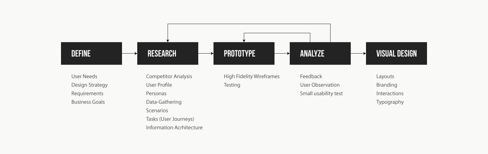
Design Strategy
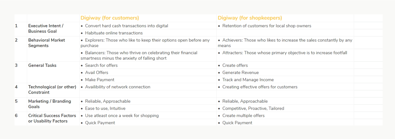
This is the first step towards interface requirements. Initial meeting with the executives gave a better picture of the business, and interviewing them to understand their goals, business plans, and scope of work. Then later converting the whole interview into a document for all the stakeholders to stay on the same page.
For this case-study i’ll be explaining only customer side of the app.
Competitor Analysis
Identifying our competitors and observing their features, methods and service to build a better product. We considered below 3 competitors for analysis
- Neerbuy.com
- Little
- Udeels
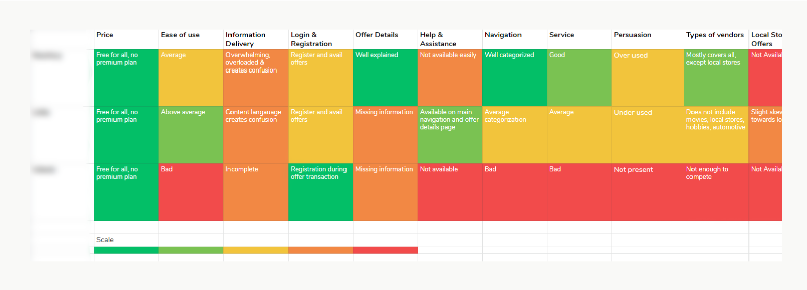
Competitor analysis gave us a good start, and we did a need/gap analysis to uncover better opportunities. It also helped us in coming out with offers that can be provided to the customers.
Some basic offers which can be availed by the shoppers are:
- 20% off on the total bill, on minimum transaction of 1,000
- Buy today and get 30% off on the total bill, max discount 200
- Cashback offer by transacting for the first time on the app
- Invite friends and earn
User-Profile
The market segment recorded in Design Strategy was used to create a detailed profile of users to generate empathy. Their demographics, environment, and basic tasks were recorded in these profiles.
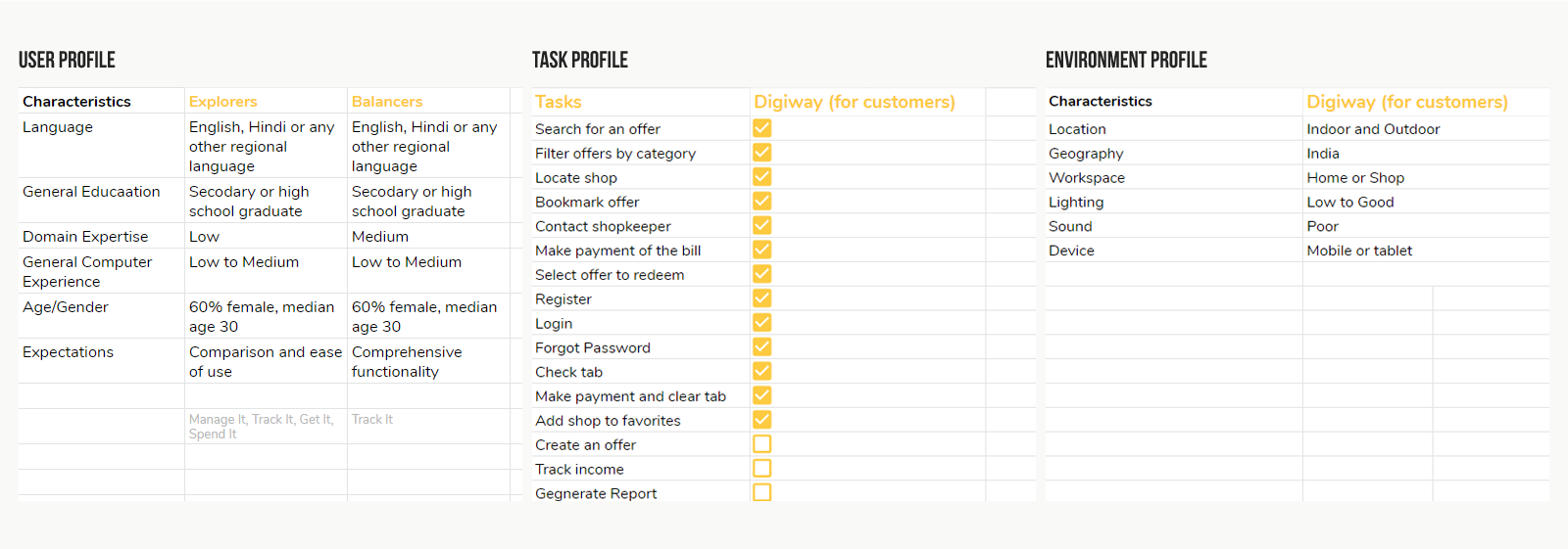
Personas
Once we finalized with the user profiles, we gave a life to them by adding personality and emotions, also helped us to distinguish between developer desires and user needs. For 2 different market segments, each had 2 different personas.
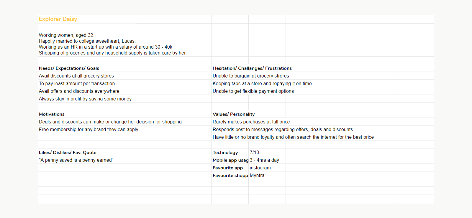
Img: Persona of a user, who falls in the explorer market segment
Data-Gathering
Two direct data-gathering methods were used, known as User Observation and Face-to-face Interviews. It gave us a better understanding of the user and the market.
User observation
It was specifically conducted inside the shops, and shopkeepers were well aware of the project which helped to reduce alteration in the behavior of the subject when observing them (Hawthorne effect).
- Making payment quicker: User observation showed that a lot many times people didn’t have exact change. We provided in-app payments using the QR code and also by selecting the merchant directly from a list of their favorites.
- Adding to the tab: We observed that local shops allow their regular customers to a policy called “buy now, pay later” (in India, it goes by “khaate main jod lena”) and it typically runs for a month, we implemented this mental model of the user in our system, where a customer can choose to pay for the bill later. Seperate module was designed to settle all the active debts, transaction records and with flexible reminders for the customer through multiple channels and language.
Face-to-face interviews
It was conducted with 10 users that were retail shop customers, these people were recruited based on our user profile and persona. This step opened up a lot of business ideas and gave us a clearer picture of their mental model. We also validated our assumptions on the profiles and personas. Below are the few outcomes of interviews:
- There are people who take that extra mile to save something on their bill, by visiting any free coupon website. They would even contact a friend for a referral so that both will be beneficial if included in the offer. Buying below MRP was the ultimate kick for our target audience.
- A product which costs Rs. 100 and sold at Rs. 90, which is saving of Rs. 10, on the other hand, a product which costs Rs. 1,000 and sold at Rs. 990, which is again saving of Rs. 10, in both the scenarios, the saving is Rs. 10, though humans tend to percieve it differently, on one product it is saving of 10% and on the other it is 1%. The 10% offer is far more attractive to the users.
Scenarios
From the interviews and user observations, we created scenarios to get more empathy towards our users. Every persona has a different scenario, which explained different tasks they performed and the way they execute them.
Scenario - Aisha's Routine
Daisy is on her everyday routine from work to home by travelling in a bus and she gets down at the nearest stop to her house. Being a working woman and also a home maker, she has a very busy life, so Daisy usually keeps a list of items in her phone that needs to be bought. She quickly goes through the list and goes to the nearest grocery store. Wishes to buy every item from the same shop and have atleast some discount on the total bill. Daisy realizes she doesnt have enough cash for now, and would like the shopkeeper to add it to her tab, and she'll pay in the starting week of next month once her salary is credited.
User Journey
After developing the scenarios, possible tasks were created from them, along with other general tasks which were derived from the data-gathering phase. All the tasks were considered as per the market segments, to have a better picture of all the tasks.
Tasks were detailed out to document the process and keep them optimized to have a shorter and seamless journey on the app. Tasks were divided into an acceptable number of steps with progressive disclosure and also reduce the intellectual load on the user.
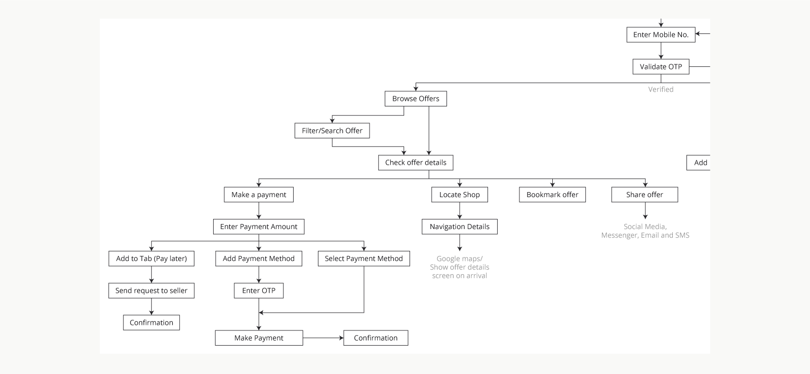
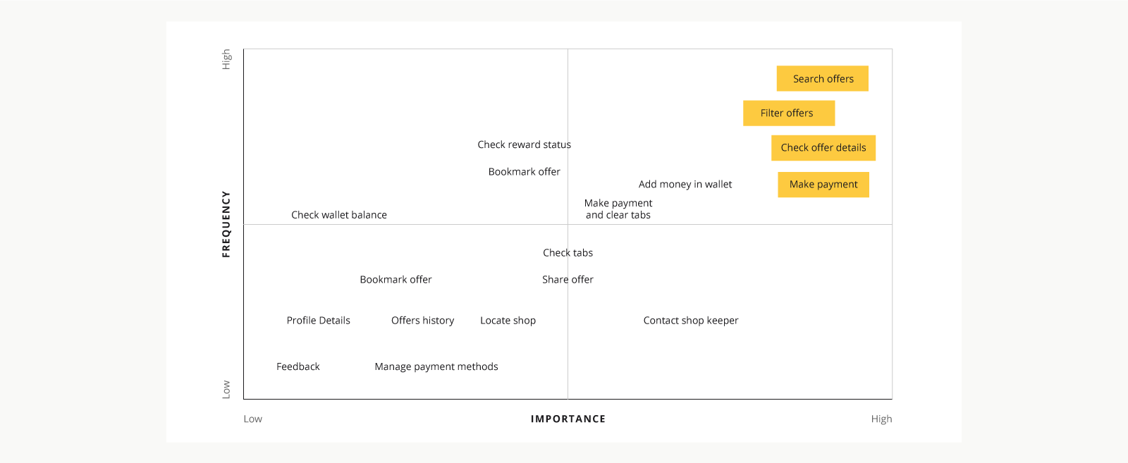
Tasks were prioritized based on their frequency and importance to help design the Information Architecture and Primary navigation.
The task analysis stage was quite helpful in uncovering other mechanisms for user engagement, our source of inspiration was user behavior, where they perform a series of actions in order to achieve the reward.
Examples of behaviors are:
- 3 purchase at Novelty Store
- Spend 3,000 in a month
- A user invited who spent 1,000
Once a user completes a series of tasks, he is rewarded with a assured cashback offer which is directly credited in Digiway wallet, or a coupon code for a partner proucts and services. The reward increases the chances of the user to come back on the app.
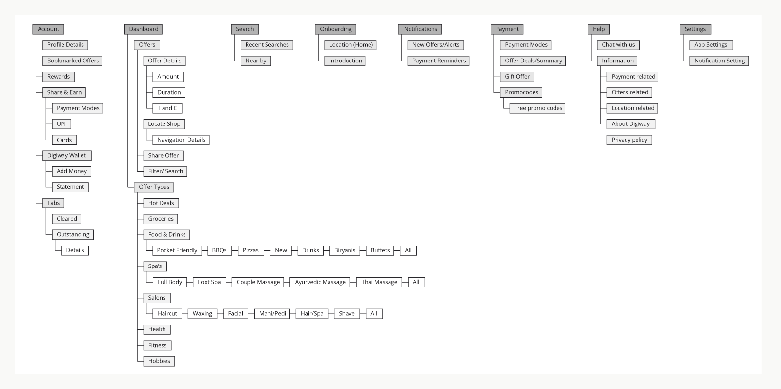
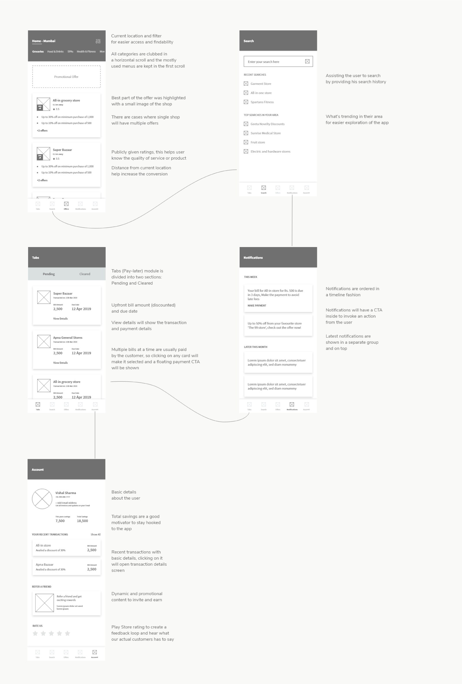
Information architecture
Organized all the information and tasks into groups and labels, this was the first tangible thing that was designed for the interface.
High-Fidelity Wireframes
Initially, a rough sketch was made to showcase the navigation model to stakeholders. Once that was done, we started with high fidelity wireframes which covered Interaction, navigation, and content.
Prototype and testing
A quick click through prototype was created of the wireframes to present the user journey/navigation to stakeholders. Feedback was taken from stakeholders and prototype was given to 4 target users for testing. All the observations during testing were noted and after a need gap analysis and its importance, we made changes in the product and in the IA.
Visual Design
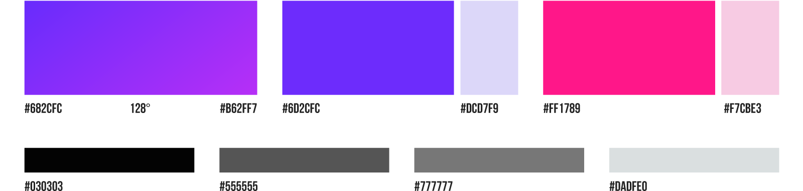
Only when we were thorough and confident with our wireframes, we started with the visual design phase. As recorded in the Design strategy, the brand is supposed to be trustworthy and royal, the color combination of blue and purple was used. White space keeps the design neat and helps overcome information overload.
Colors
Typography
Light / Regular / Bold
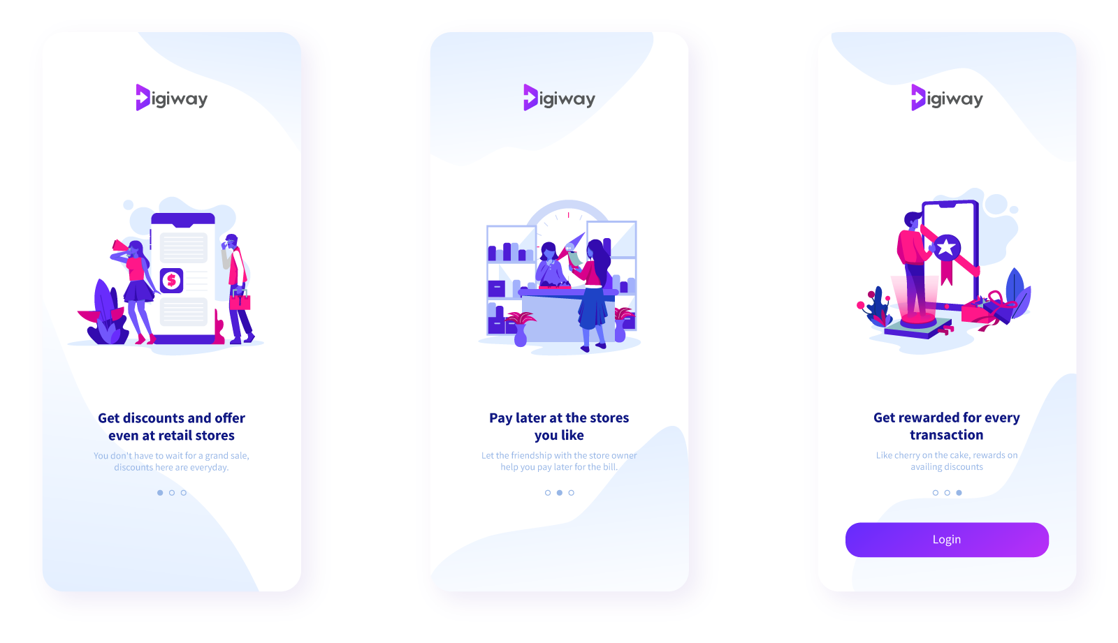
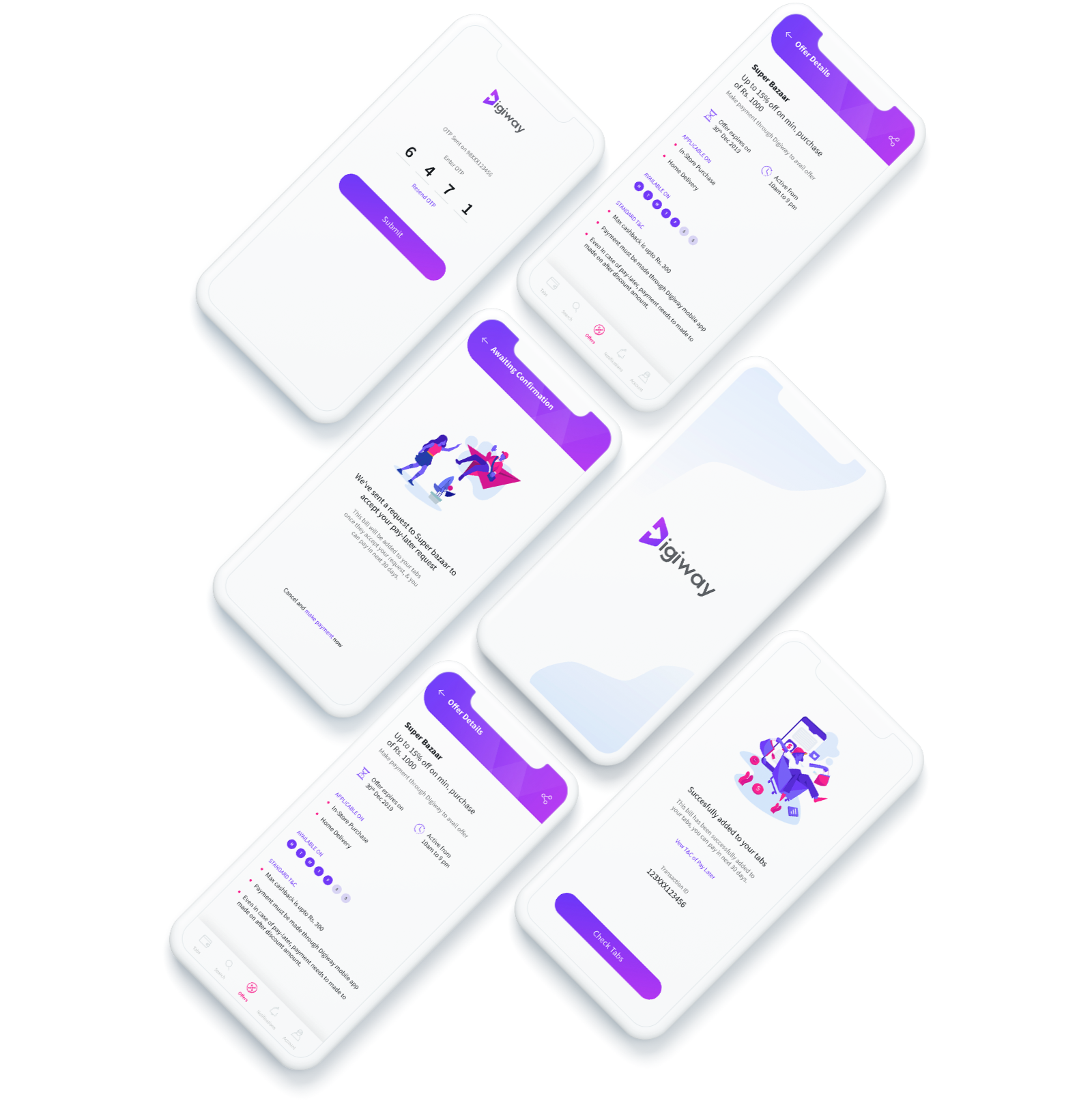
App Onboarding
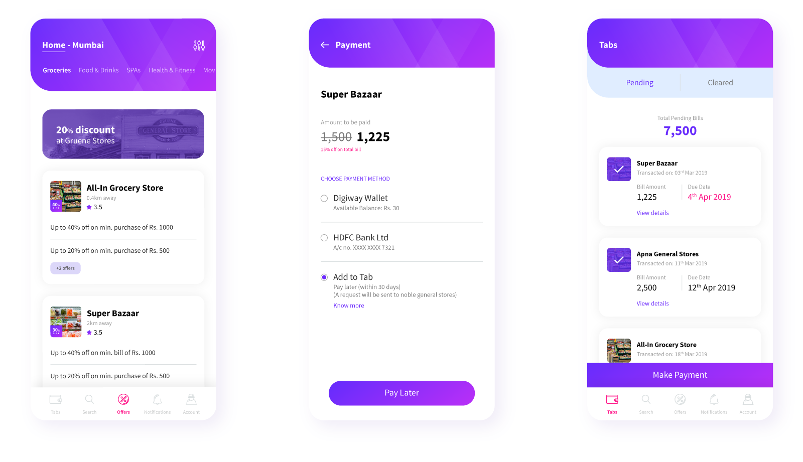
Offers and Transaction Screens
The design and research phase of the project went well, and the development started too, but due to some unforeseen circumstances, the product couldn't go live. It was hard to fathom and quite disappointing but nevertheless, there's always something to learn.
Project Learnings
Process is Important
Following design process when building products will not only help keep the project in order but also increase the quality of the product.
Feedback is vital for any system
Feedback allows one to know that they are imperfect, but leveraging that feedback to improvise designs will be one of the key factors for innovation.
Stats

Duration
2 months

Coffee meetings
16

Stretches
1,500
