Overview
5nance.com provides financial advisory that helps its customers fathom complex investment products and helps them invest according to their comfort levels, requirements, and goals. The product is a one-stop shop for all financial requirements and covers mutual funds, fixed deposits, debentures, insurance, and loans of all types.
My Role
I led the design of overall architecture for emailers, which boils down to when and what is supposed to be communicated to the customer.
I collaborated with my Team mate Amit Jain, a fellow UI/UX Designer, along with a marketing specialist, content manager, and couple of front-end developers.
I stopped working on the project once the architecture and content was set, and the visual design phase initiated.
Problem Statement
Simplify and improvise Email and SMS communication for transactions, which increase user engagement, conversion rate and customer satisfaction. The current scenario of communication is quite inadequate and not upto the mark for e.g., in Emailers, no call to actions were present, incomplete or missing critical information, vague Email subjects, not sending some important transactional updates, and weary visual design.
Existing design of Emailers
- Subject line is not to the point
- Confusing Call-to-actions
- Irrelevent table headers
- Directing the user to do a task rather than guiding
- Repetitive contact options
- Irrelevant mascot
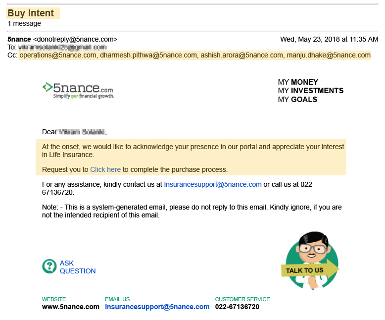
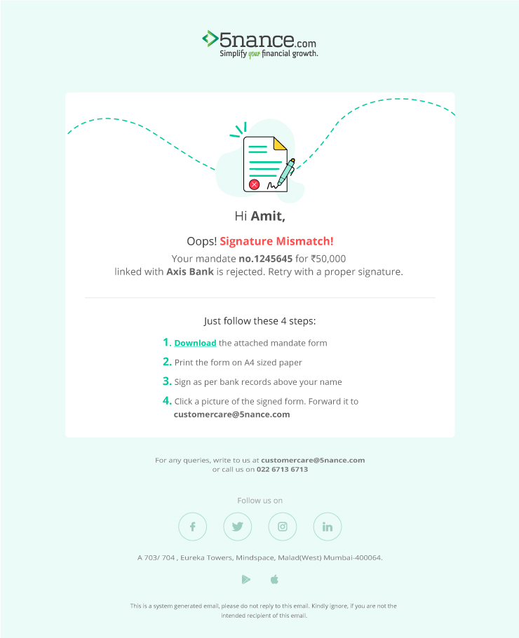
- An Email which is triggered by system when user begins a journey in any type of insurance.
- The subject line says “Buy Intent”, It’s really hard for the user to understand what’s inside this Email, also this leads to lower Email open rate. This was replaced with dynamic content based on multiple factors like time of the year, type of customer, total visits, and geographical location.
- Body of the Email says “click here to complete the process”, a method which has the least conversion rate. This was replaced with a larger Call-to-Action which said simple words “Buy Insurance” and persuading the user with lowest premium and least effort for applying.
Research
Understanding methods, technology and creating a brand presence in customers mind.
Methods of communication
63% of Email users now open Emails via a mobile Device, so it is extremely important that they are responsive and legible. Emailers to be sent for all events in user journey but SMS to be sent only for important events. Although it seems there isn't much to design in an SMS, we looked deeper and analyzed that, it is important to keep the content short and crisp but also convey the exact meaning, and a tiny URL for user to take action on it and to have a appropriate sender name so its easy for user to recognize the brand.
Leveraging Technology: AMP for Email
AMP(Accelerated Mobile Pages) is a technology known for developing super fast web pages on mobile clients with UI controls like carousels, dynamic lists, dropdowns, basic but responsive form elements, etc. AMP for Email is having the same controls inside your Email message, making Emails fully interactive and responsive. Exploring this technology was quite fascinating as it was something innovative in Emails since the invention of Emails.
Brand Building
Customers are constantly bombarded with Emails, ranging from minimum 10-100 in a day, brands have very fewer chances to stand out from the crowd. But crafting emails that are extremely relevant, timely, and tailor-made for the recipient with a good tone of communication, with good visual, and brand guidelines can not only help create a good brand presence but also increase the chances of opening an Email.
Execution
Creating a project map, targeting users who dropped, implementing solutions, and keeping it simple.
Building the map (Information Architecture)
The key to implementing a good communication system is leveraging customer journey and information architecture of the product. Using every touchpoint as a meaningful interaction with our customers. It will not only open new ways to communicate but also reveal opportunities for better customer experience. We mapped the user journey for all the possible Emails that need to be sent to the user, specified in one single document.
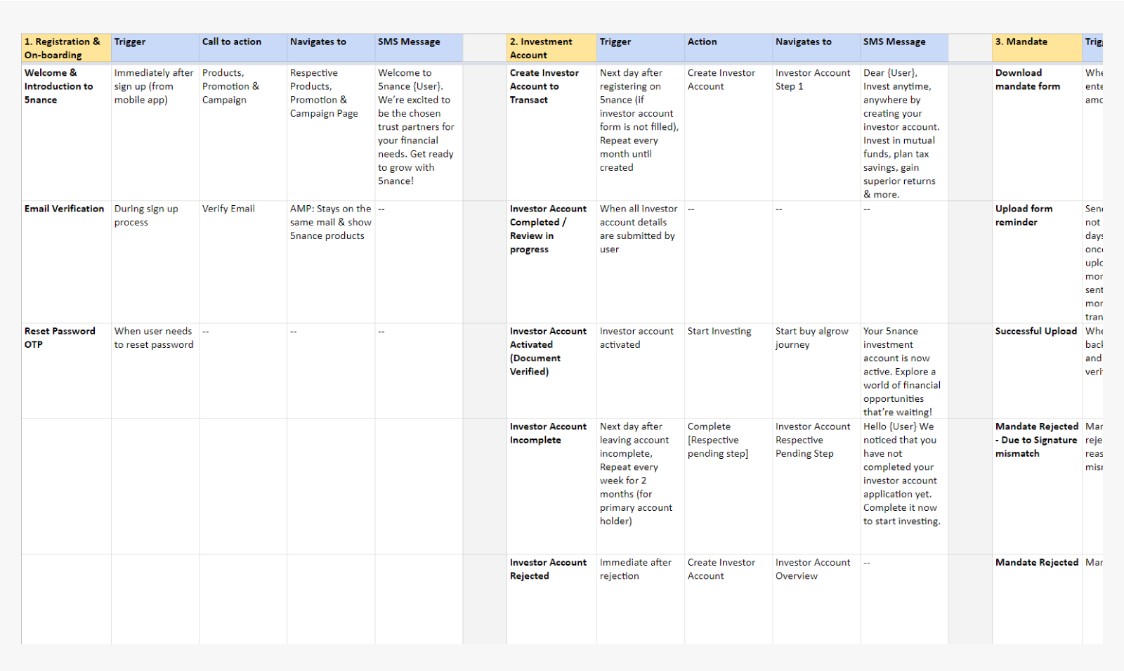
Img: Email name, Trigger, Call to action, Navigates-to and SMS Message.
User drops & Customer Journey
Focusing on user journeys allowed us to find out some cases which were missed before, for e.g. When a user is applying for a loan and drops on the application form page, we shall keep the form data saved and send them a reminder to complete the form, and customer can resume the journey exactly from where they left with the pre-filled data.
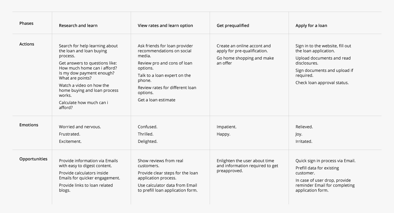
Customer Journey for Home Loan
Oddly specific subject lines
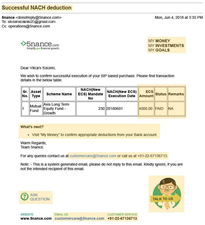
Subject lines are like a cover of the book or a headline of an article. The subject line should strike a balance between informative and intriguing, inducing people to click without over or under-promising on what’s inside. It should also have an overview in case of transactional Emails for e.g. When investment order is executed, the subject line should say “Order Executed: [Mutual fund Investment]”, Here Mutual fund investment is Dynamic, which is based on the product order. Since humans mostly skim through content, the fixation of their eyes is mostly on the first three words, so the most important words are kept in the beginning, here it is “Order Executed”.
Implementing AMP in Emails
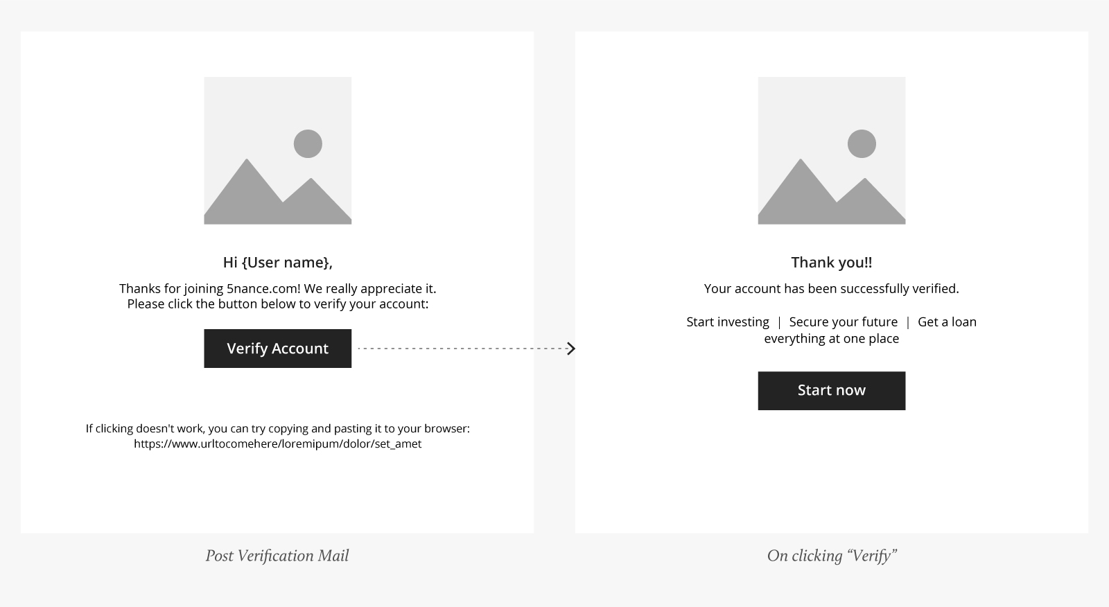
Since AMP allows us to create dynamic Email messages, like adding a carousel, dynamic lists, basic forms, there are a lot of opportunities to improve the customer experience here. We focused on the user journey and found out those touch points where they simply have to come to the website to do a small task which could have been done right there in the mailbox.For e.g. it is a must to verify your Email ID to buy financial products on 5nance.com, the current scenario is, sending a link in the mailbox, then the user clicks on it and then redirected to some page where it says email verified.
We made it short and sweet where you get the verification message right there in your inbox.
AMP Emails were made for scenarios which created friction in the user's journey, like
- Knowing customers interest from investments, loans and insurance
- Filling out a missing field to complete profile
- Exploring top-selling credit cards and recommended insurance
- Feedback forms
- In case of loan rejection, applying for another loan.
- One tap buy Mutual funds and many more.
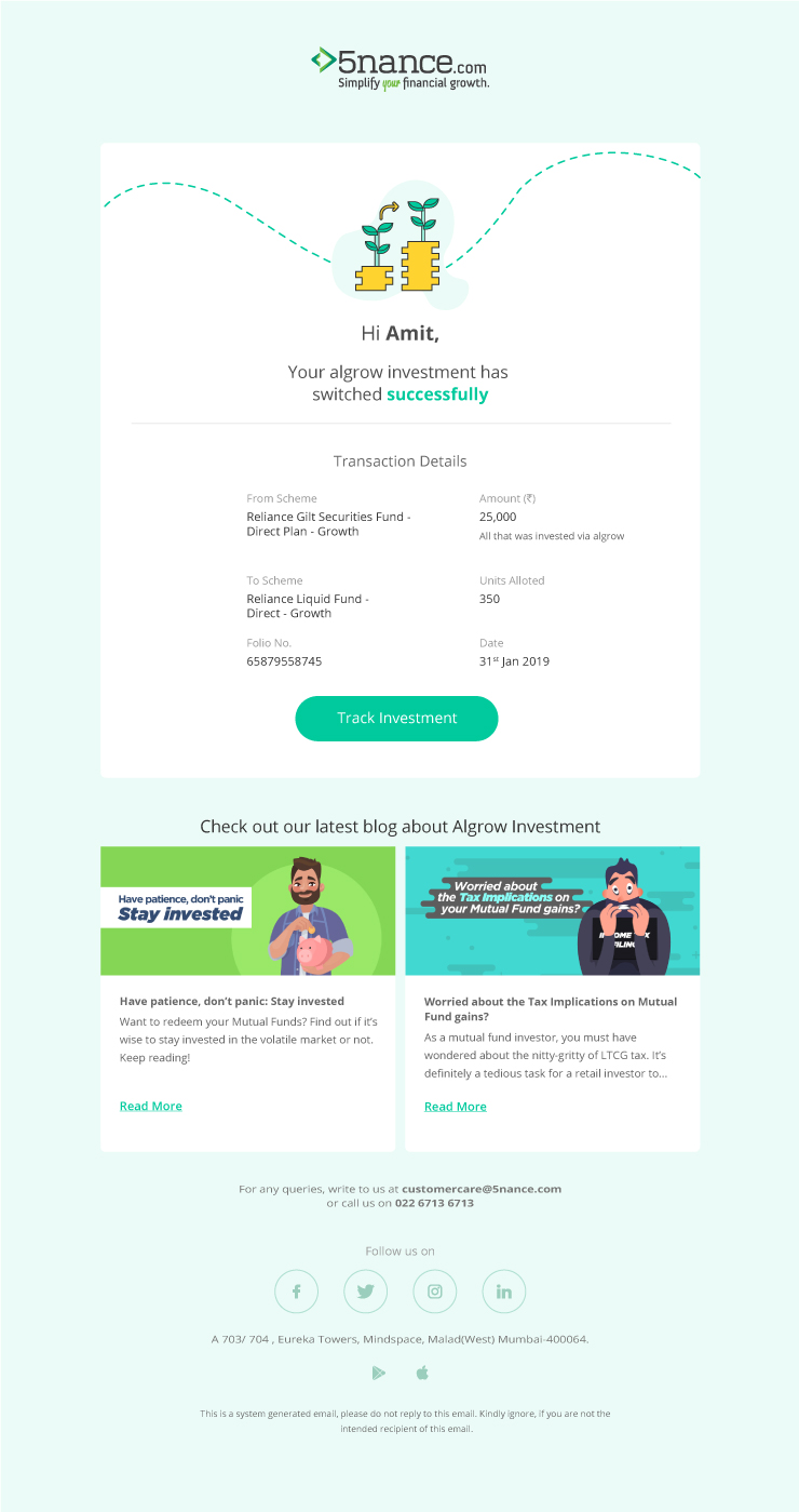
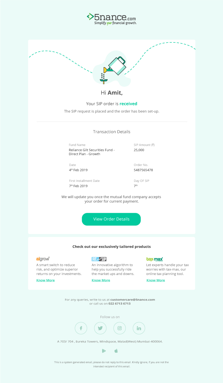
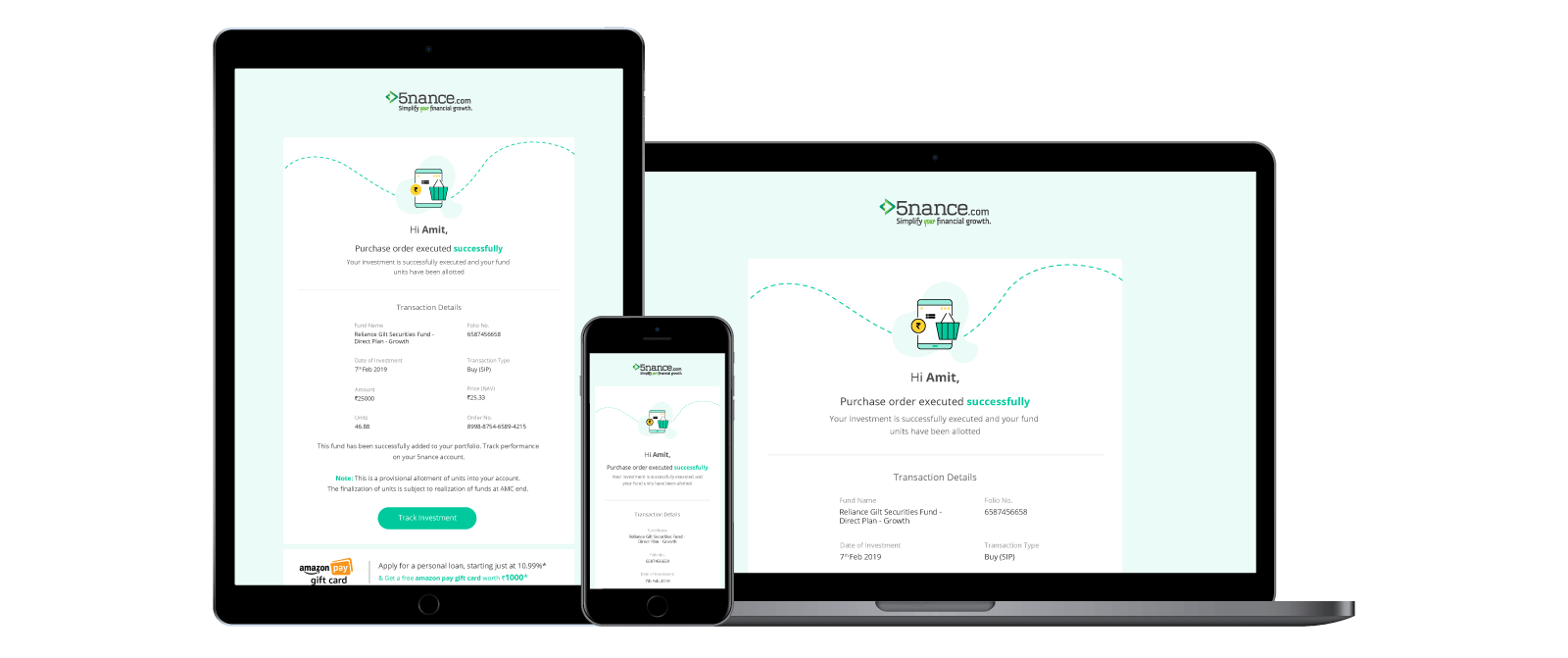
Visual Design
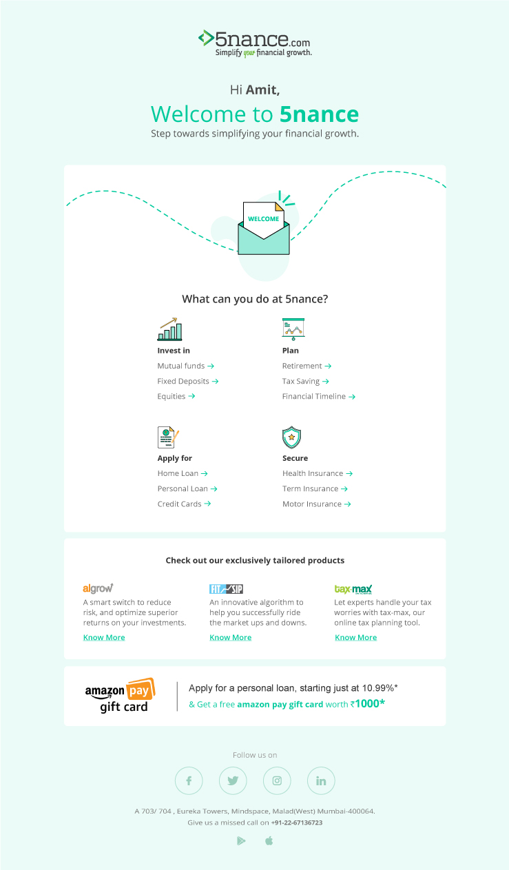
The visual design part of the Email was aligned with the new app of 5nance.com. which includes colors, typography, icons, and illustrations. Usually, the transactional Emailers are lame and boring, without enough visual hierarchy, and user engagement. We decided to do something different.
Wrap Up
We were glad about the end result and that we executed the project successfully by increasing the Email open rate and conversion rate. Visually it is quite appealing to look at, unlike some old boring transactional Email messages. We also received a lot a good feedbacks from our customers, since it was easy for them to just skim and understand the whole Email in a gist.
Project Learnings
Timing is Important
A properly timed Email, escpeically when it invloves your customer’s money, improves the customer experience a whole lot more. It not only gives an assurity of safety but as a business it shows ethics.
Importance of User Journeys
User journey reveals some important ascpects of users life when interacting with the product, and a designer can feel a lot more empathatic for their customers.
Stats

Conversion Rate
2.9% (+0.8)

Total Emails
182

Duration
1 month
