Introduction
Trip Darwin is an online portal to create, share and book beautiful and cost-efficient itineraries. It’s primarily designed for B2B users, whose needs are to create and manage multiple itineraries.
Brief
Complete redesign of existing Trip Darwin website with an aim to increase booking transactions, user onboarding, brand loyalty and reduce dropouts.
Process
- Stakeholders Interview
- User Research and Analysis
- Wireframe and Prototype
- Visual Design
1. Stakeholders Interview
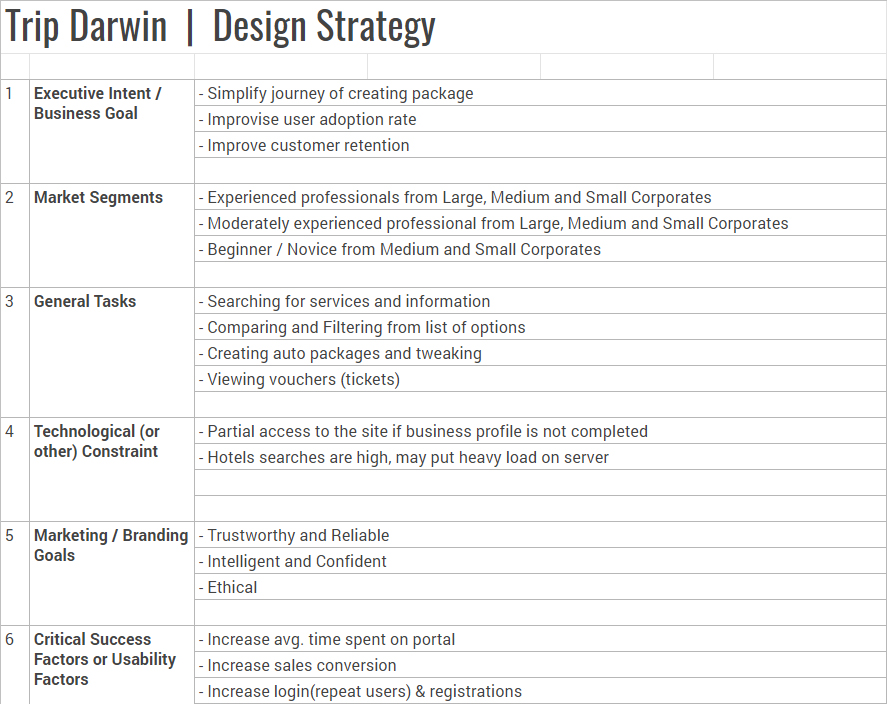
A series of discussions were planned with top management of the company, to understand the business goal, core proposition, target audience, success factors, and technology/legal constraints. Everything had to be documented in one single file for everyone to stay on the same page and to avoid moving goalposts.
2. User Research and Analysis
Usability Testing
Since Trip Darwin already had a product running, so I tested it with 5 users which opened up a lot many problems faced by users. Post UT, I conducted interviews with the same users to understand their perception of the product and thing which they thought were good/bad.
Personas
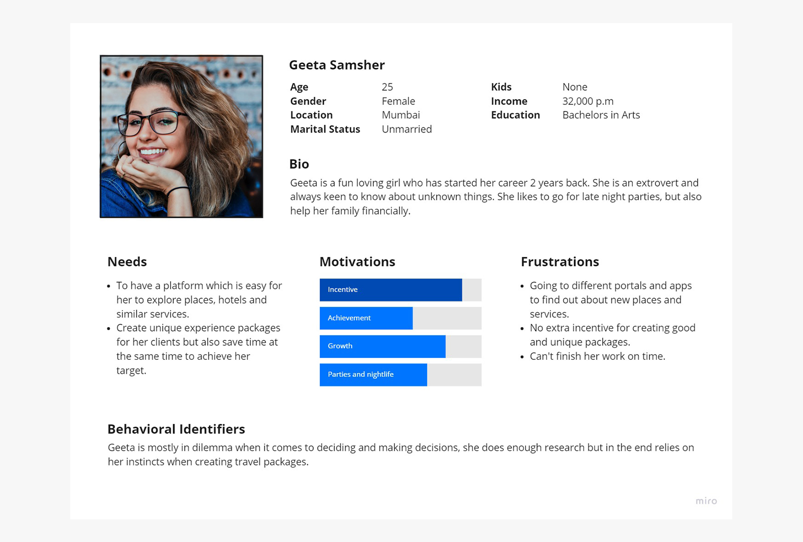
With the stakeholders interview and UT, I created multiple personas that could match with the target audience, creating personas helped the organisation empathize and reason on behalf of the users.
User Interviews
8 users were interviewed which matched with our personas, and were already using some other platform to manage itineraries. They were questioned on how their organizations operate, what were their motivations, incentive structure, collaboration with other teams and departments, and managing clientele.
Scenarios
To empathize even more with our users, it was must to create ideal scenarios which had important tasks performed by the users on a daily basis, considering their environment, and communications with client. One of the scenario:
Geeta Samsher's Itinerary
Geeta is having a usual day at her office, sitting at her desk and busy with booking trips. She gets a call from one of their clients named Akash and is looking for a trip to Vietnam, to which Geeta is quite familiar. He asked for a quote along with an itinerary for 4 days and 5 nights for 3 guests. Geeta asks him few questions like nature of trip, age group, preferred dates, origin and preferred flights. Geeta immediately tells him a rough estimate of the trip and said she'll get back with a perfect itinerary in an hour. She quickly finishes the task at hand and starts planning and creating an itinerary for Akash. Having an experience in creating a trip to Vietnam, she was familiar with hotels and activities, but never booked a package along with a meal. She starts searching on google for good Indian Veg restaurants around the hotel and starts adding them in the itinerary. Once the package is complete, she quickly exports it to a text file, copies the text and pastes it in a mail after which she had to format the text with titles, paragraphs and cost. In total, she spends around 4-5 hours to create a sample itinerary and share it with client.
Competitive Landscape
There weren’t any direct B2B competitors of the product in India, since the proposition of providing all travel components in one portal was quite unique. Some indirect competitors were analyzed and compared like, RaynaB2b.com. Utrip.com, Metripping.com on the basis of their values, functionality, branding, and features.
Task Analysis
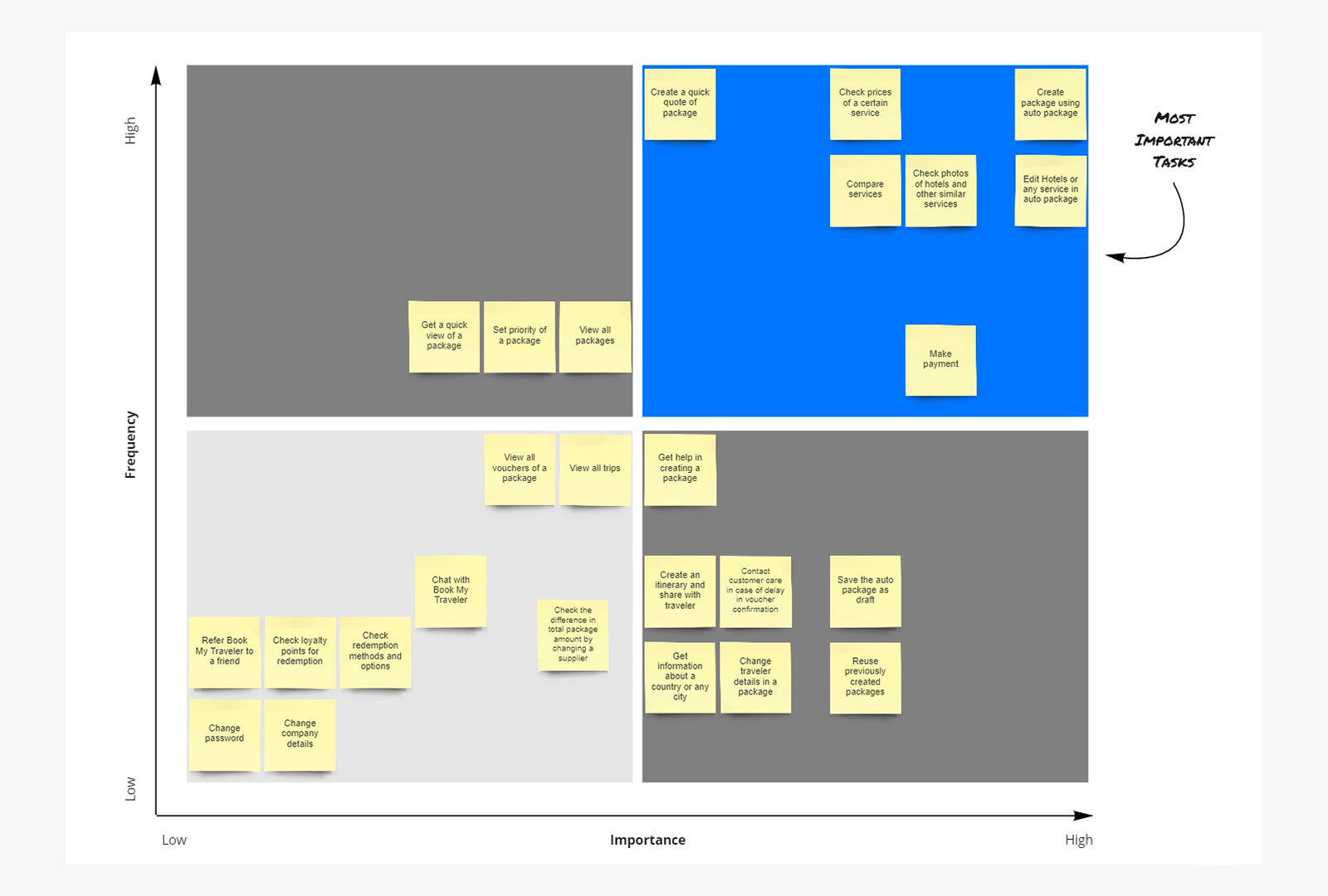
A list of all tasks were created to map it on a task analysis graph, with x axis showing ‘frequency’ and y axis showing ‘importance’. I focused on the most important tasks with high frequency to make the product easier for the users. For e.g. Creating an automated trip, Change a travel component from trip like a hotel, etc. were some of the tasks which I focused on.
Customer Journeys
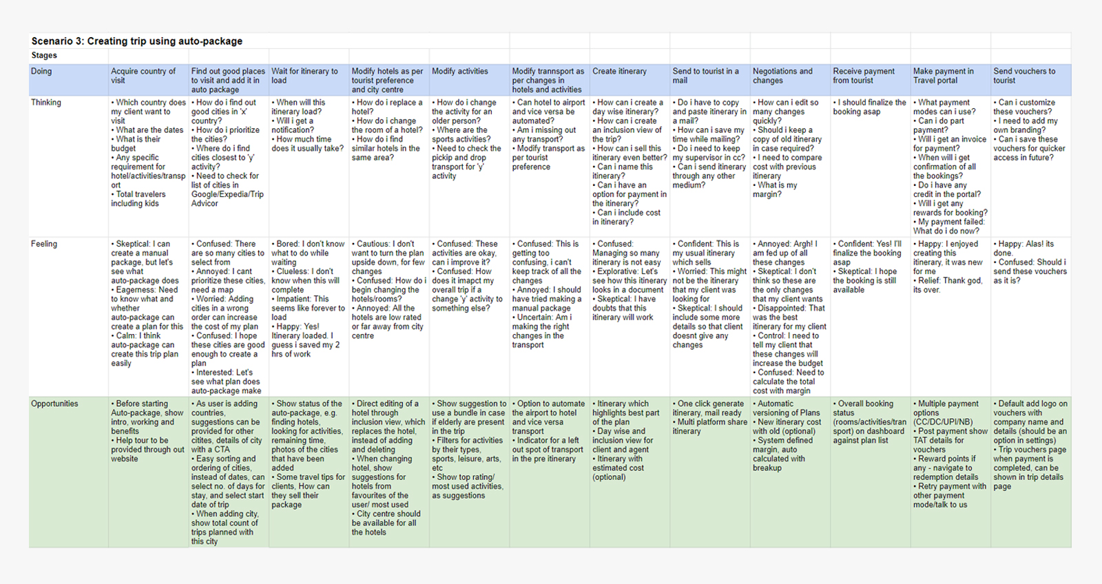
A customers journey while using the product with each step showing what user is thinking, feeling and emotions attached to that step. This helped me to improvise the experience of certain steps which had either bad emotions, confusions or any kind of friction in the journey.
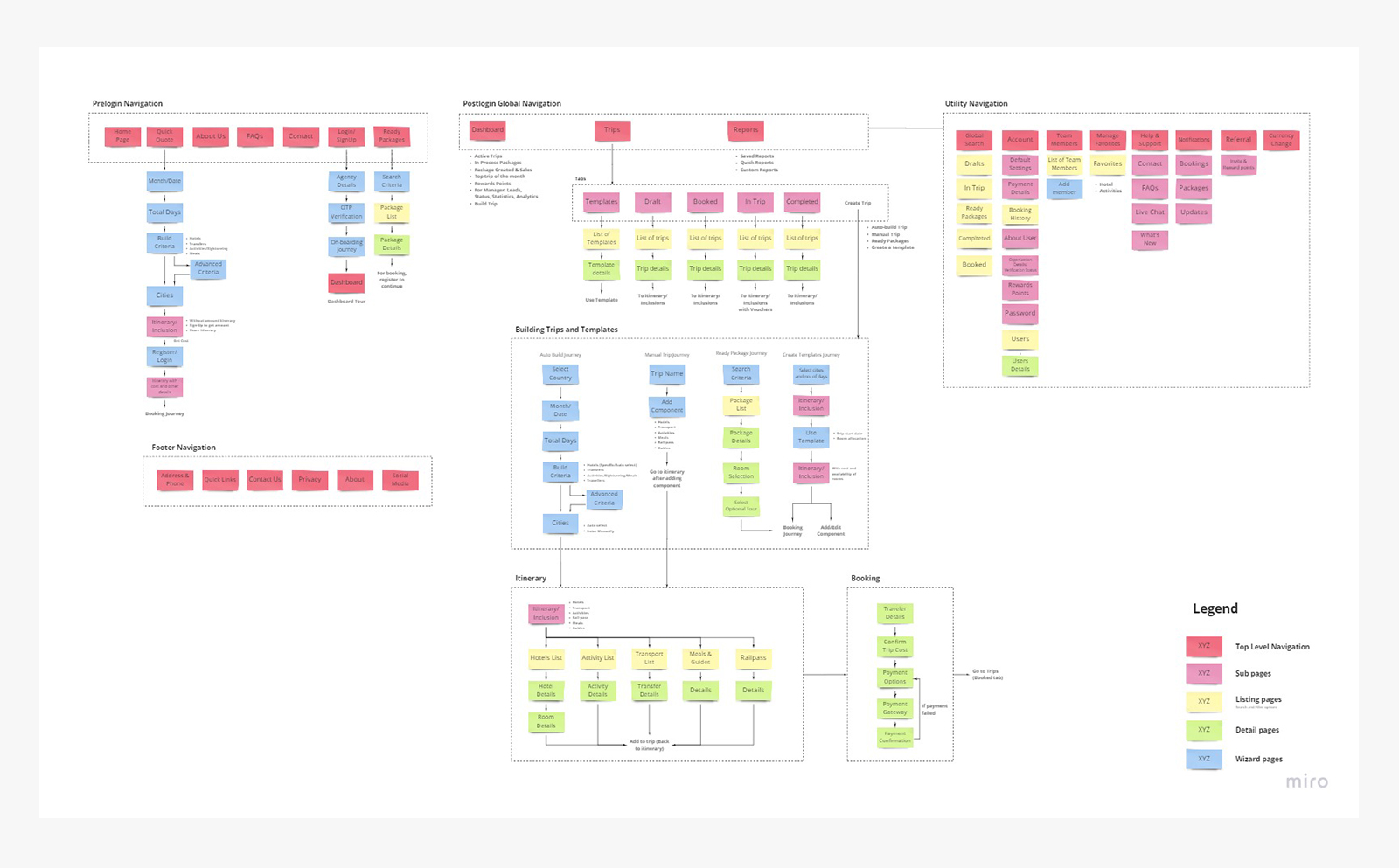
Information Architecture
Once the personas, journey and tasks were in place, it was time to start with Information architecture. Placing related entities of the product in a group, which matches the users mental model and provides quick, easy and intuitive access to the portal.
3. Wireframe and Prototype
Sketches
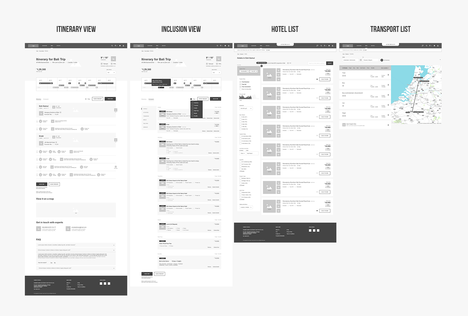
Some journeys and pages were quite complex to begin with wireframe, such as itinerary page, showing a summary of trip day-wise which includes hotels, transportation, activities, meals, and guides in a single page. Also providing enough details in order to reduce friction to access frequent data. I chose to start with the traditional pencil and paper, It not only opened up new ideas and layouts, but also allowed me to share ideas quickly with the stakeholders.
Wireframes
There were some pages which required a bit of detailing, and creating a wireframe on Adove XD was a better and quick option. Almost each and every page was designed in Adobe XD, and were presented to the stakeholders to convey content, layout, screen flow, and navigation structure.
Prototype
After presenting all the wireframes, stakeholders got confused with so many screens, after all processing 10 dozen screens is not that easy, they also couldn’t create a complete picture of the navigation and user journey. We were a bit behind the schedule for the project so instead of having multiple rounds of discussion, I quickly created a one-way click through prototype of all the important screens, and shared the prototype link via XD! What i next saw was all smiling and happy faces of stakeholders. They had a clear vision of what their product will look like and how its going to function. It was time to move on to Visual designs.
4. Visual Design
Brand Colors

Typography
| H1 | Heading 1: 36px Bold |
| H2 | Heading 2: 28px Bold |
| H3 | Heading 3: 24px Semibold |
| Titles | Titles: 18px medium |
| Call-To-Actions | 14px medium |
| Paragraph | Paragraphs and explanation text: 14px Regular |
Final Product
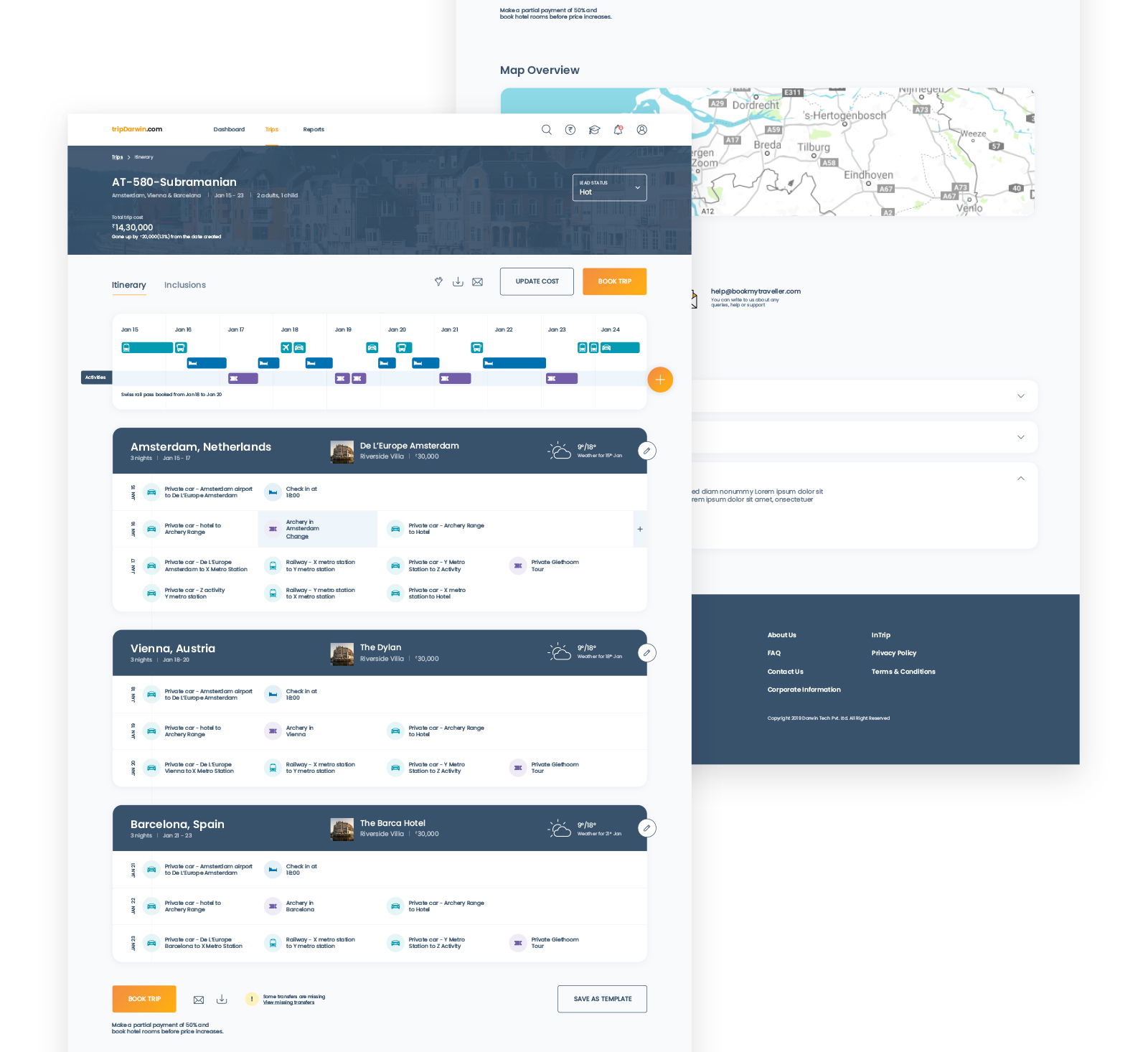
Intuitive Itinerary View
The center page for a trip, more like a dashboard where a user can take all the actions, it's a combination of overview and details of all the trip components. A higher prominence and easy access was given to all primary actions like adding a component, booking trip and sharing itinerary to increase the user's efficiency.
Simplifying search and browsing itineraries
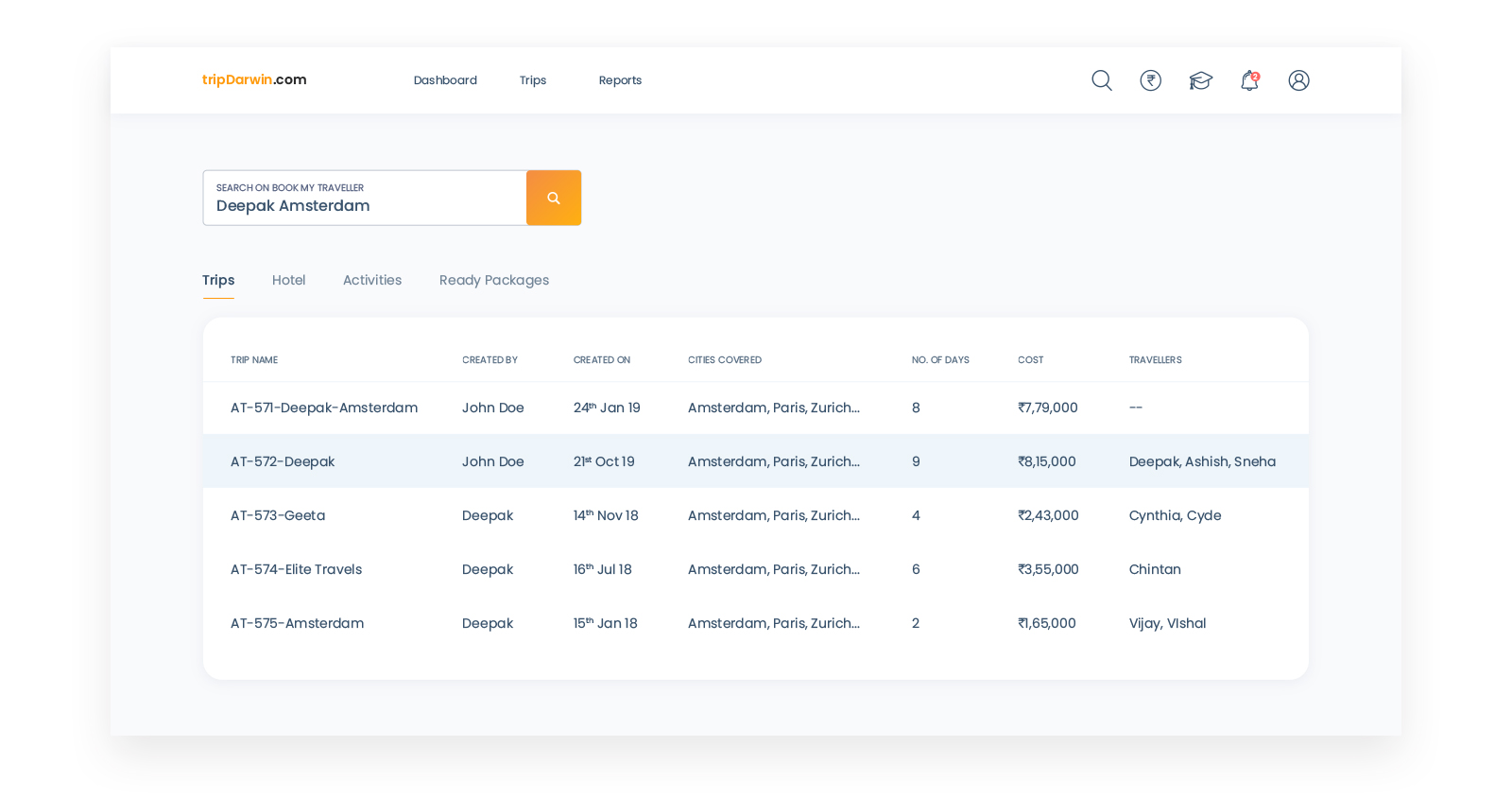
During the research it was observed that agents had difficulty in sharing the itinerary with other agents. They usally went by searching in the mail trying to figure out which keyword to use, or scrolling through endless list of itineraries inside the system. To simplify this, a global search box was added on the header, which led user to a specific search page with different search functions. Along with a search page, each itinerary when created, was given a unique name, for e.g. AT-632-Subramanian, AT stands for Auto-Trip, and this whould change to MT for a Manual Trip and TE for a Template. The number followed after AT is a unique number which is auto-generated for every new trip. And the last part "Subramanian" is customizable, and the application by default uses the travellers name. It also makes easier for a colleague to share the itinerary name verbally.
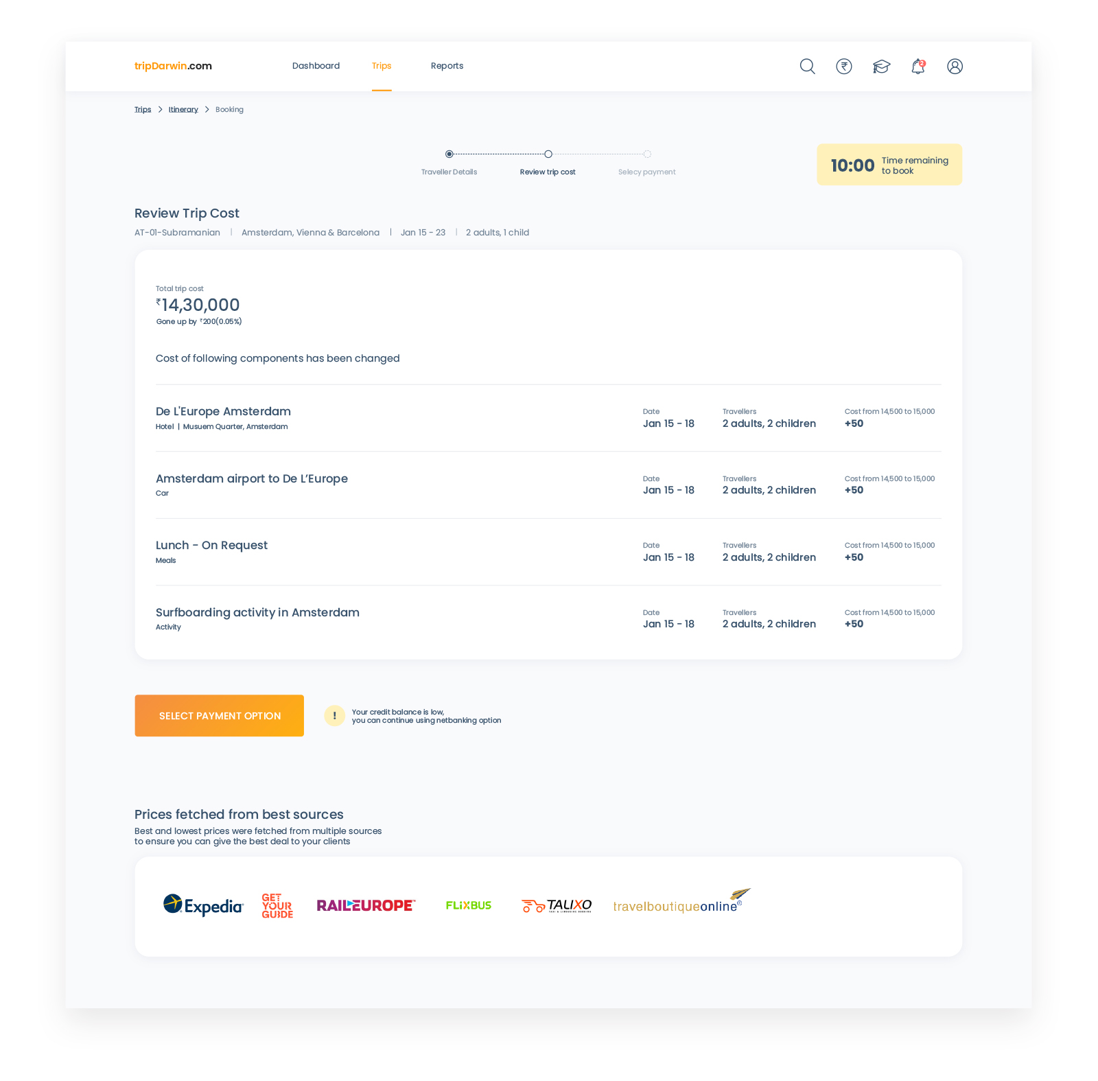
Reducing friction in the booking journey
The old design took 8-9 clicks with an average time of 20 mins to completely book a trip for 4 travellers, which was cut down to 3 clicks in the new design. For a travel agent, faster booking means more time to manage and engage other clients.
Eliminating redundant tasks
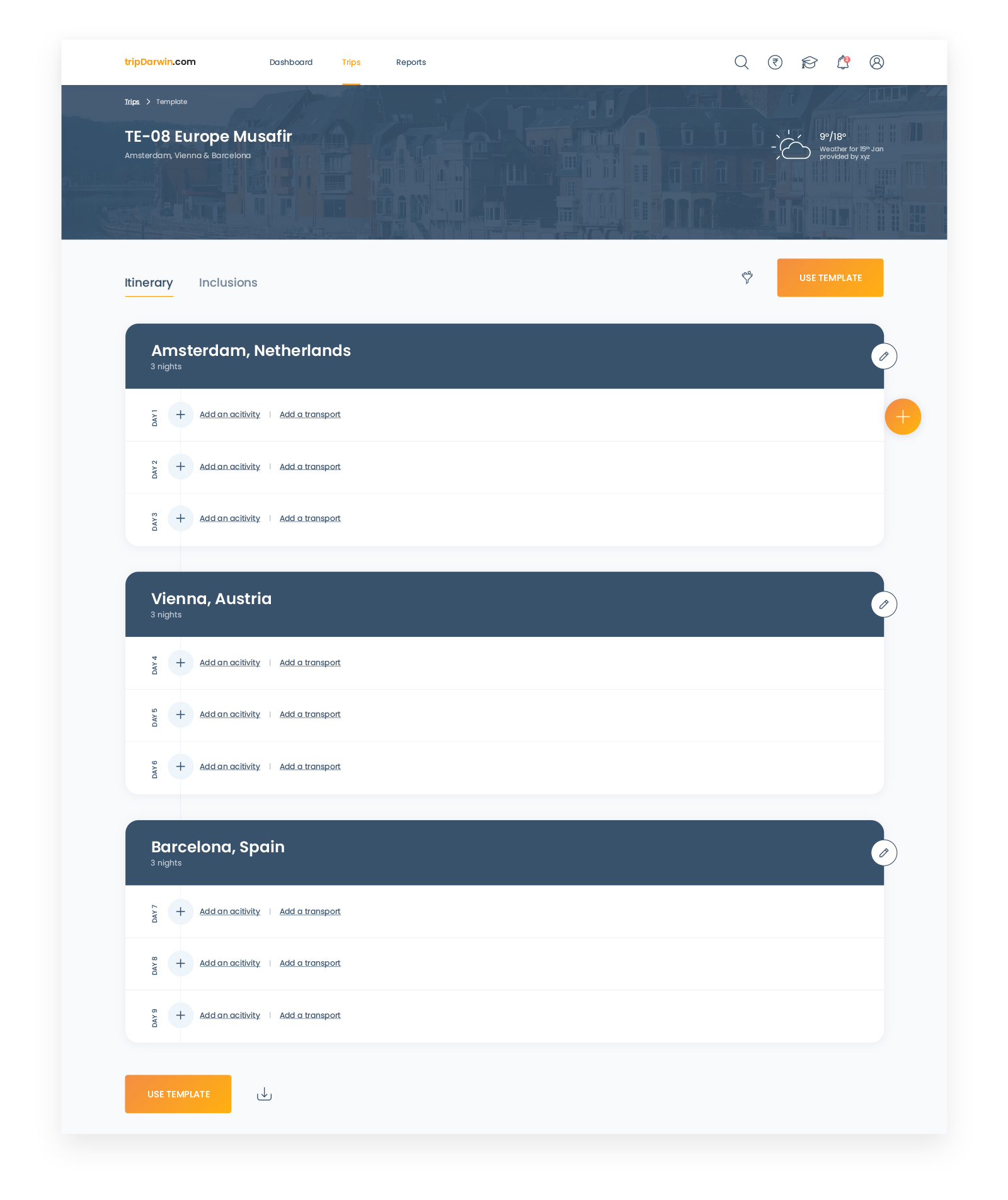
Most of the time an agency gets inquiries which are repetitive in nature, for e.g. A trip to Paris -> Zurich -> Amsterdam for 8 days. To handle this a lot many travel agencies had their own customized template saved somewhere in a word or excel file, sometimes on a post-it note. They always had to go back to that word file, check the latest prices for all the components, add them up and share with the client. This redundant work had to be cut down, in the new design. I matched it to their mental model and created a separate section for templates. They can be separately created or any other itinerary can be saved as a template which they can reuse it, refer it, or just get the latest prices to share with a traveler and to increase collaboration in a team, all the templates were accessible to all the team members.
Improving the flexibility of adding components
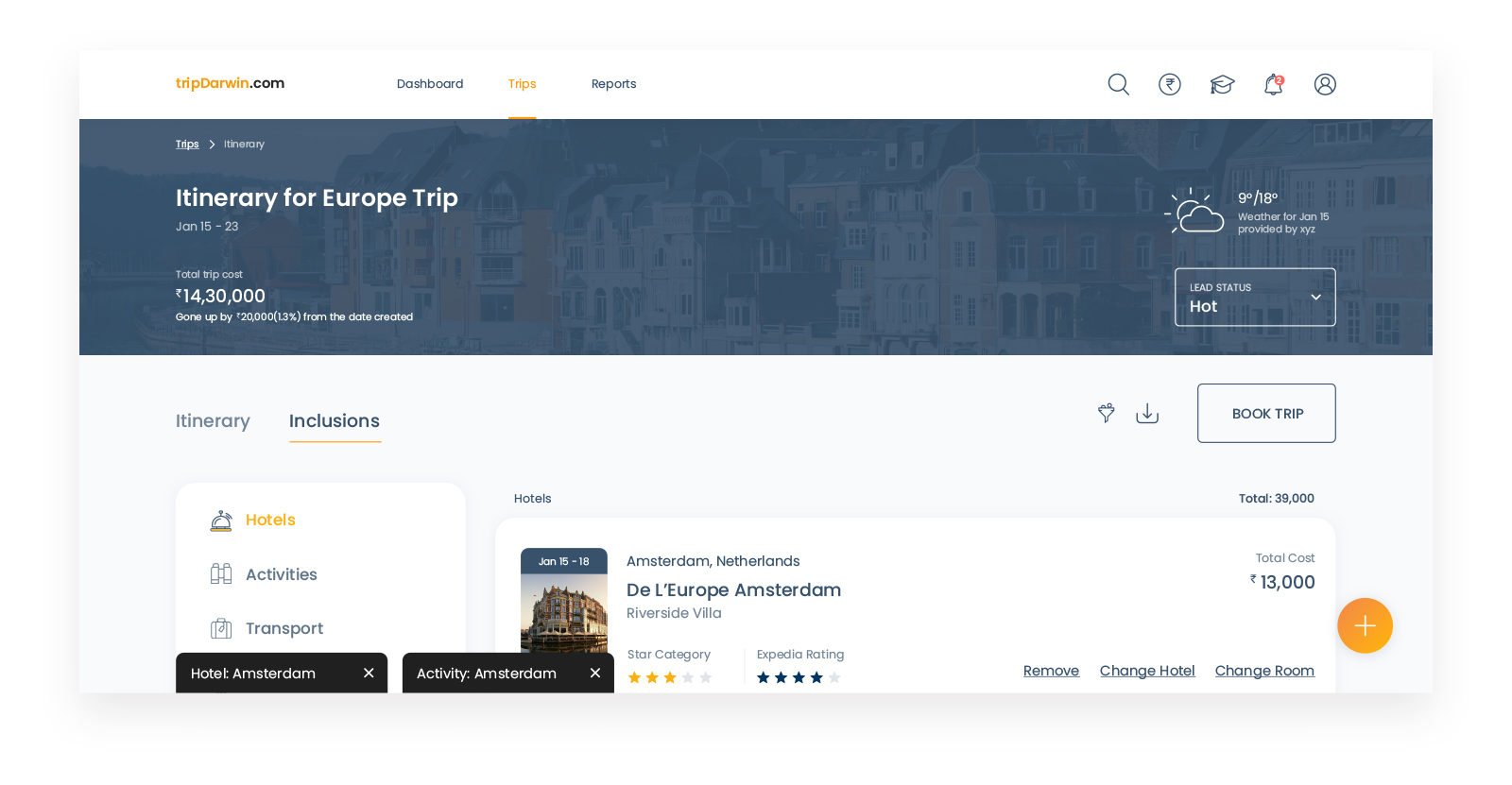
While and after adding trip components, a common behavior was observed in all the users, they all jumped from one component to the other quickly, and sometimes back to the itinerary to get a quick overview of what they have completed till now. This behavior was included in the design using minimizable tabs for all components. When a tab is minimized, the user comes back to the itinerary page to get the overview, and they can maximize the tab again and go back to the task they were at.
Rewarding customers on every booking
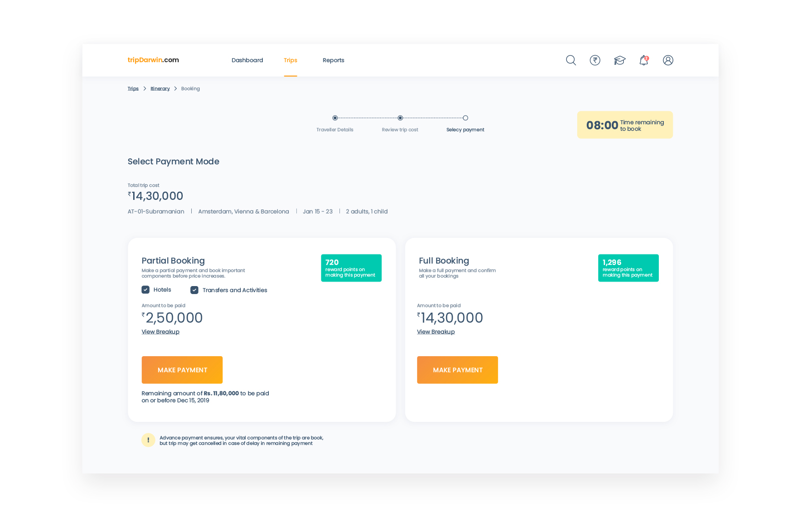
The pricing for hotels offered by Trip Darwin is sometimes higher than the other portals. It was important that people don't abandon the website just because of a little higher price. So we planned to reward the agent on every booking using reward points, and once enough points are accumulated, a free trip is awarded to the agent/agency.
Increasing leads
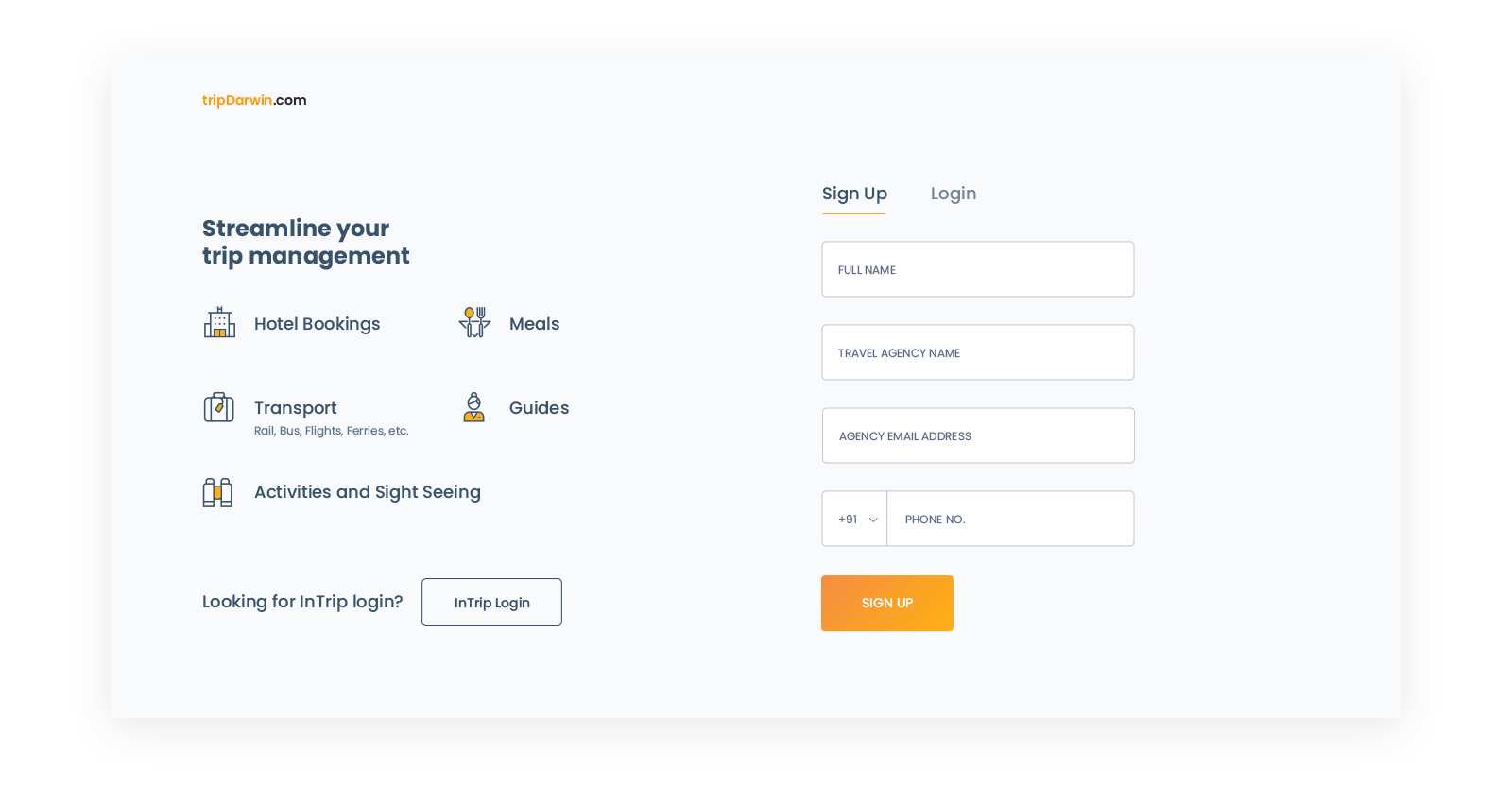
There was no direct registration for an agency in the old design, they had to fill up a form with their requirement of a trip, along with complex fields like TIN number, Company address, etc. We discarded this method altogether and just asked for basic details that are always and easily available. The main idea was to allow agents to try out the portal as quickly as possible by shortening the onboarding journey.
Sharing Itineraries with Travellers
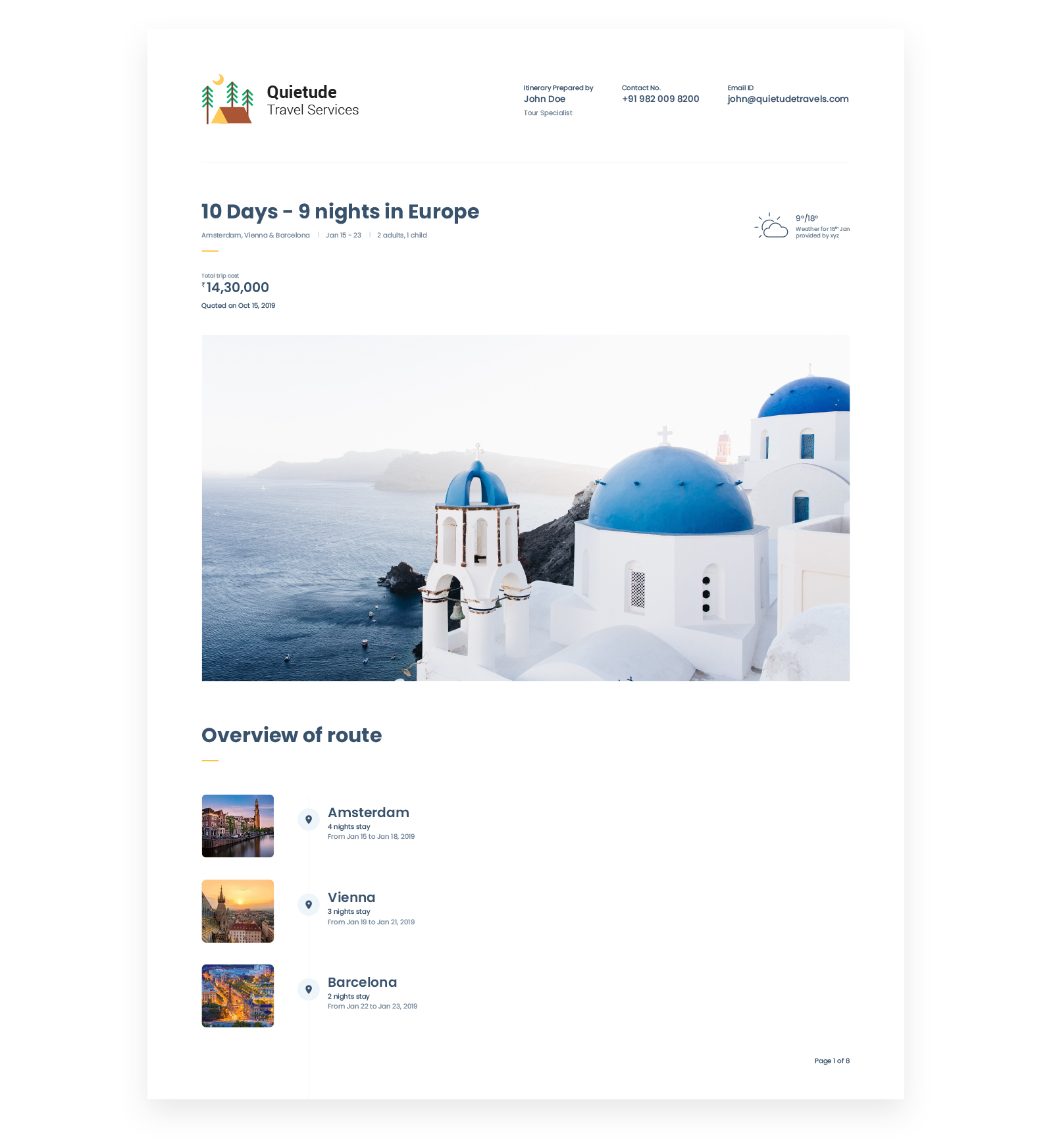
An agency can share the complete itinerary with a traveler on email with all the tiny details of a trip. Simply making the itinerary customizable with details of the agency like it's logo, contact info, advisor/agent name and payment info would make it more convincing for the traveler to book the trip and for the agent to use the system.
We were proud of building the system correctly from day one of redesigning, believing that spending the time to start with the right abstractions is the best investment with exponential returns. Tearing down the whole information architecture and building it from scratch, the only certainty is that future designers will build on top of the existing model, so the time spent building a proper foundation is paramount.
Project Learnings
Decission Making
Possibilities are endless with ever increasing needs of humans, technology can fulfill it to an extent, but in order to truly meet their needs and touch their emotions with a delightful experience, it’s important for a designer to take charge and bring the change.